Shantell Martin is a public speaker, curator, philosopher, cultural facilitator, teacher, choreographer, songwriter, performer, and more. I was blown away when Shantell approached me to make a custom font – especially because of the idea she had for it: a “new Comic Sans,” with her marker handwriting as the basis for it. Together, and with a few additional contributors, we created Shantell Sans.
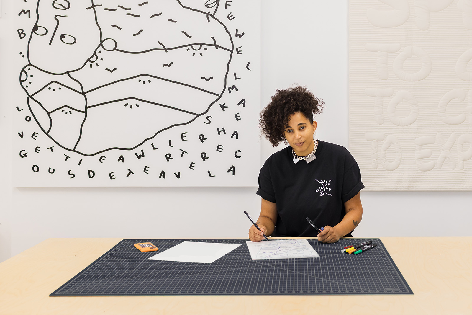
Shantell Martin is perhaps most famous for making large-scale murals that featured improvised, wandering lines, playful characters and stick figures, and words that prompt the viewer to introspection and, perhaps, new insights. Above all, Shantell explores the power of the hand-drawn line to take us on a journey. With Shantell Sans, we sought to reflect her energy, creativity, and spirit of exploration.
Handwriting fonts always pose a central design question and challenge: do you attempt to make something that mimics real handwriting (e.g. with many alternate forms for each character, an uneven baseline, and intentional messiness), or do you attempt make a font for good typography (a highly subjective quest, but one that usually involves finding the best single shape for each character, and prioritizing consistency over personality).
With Shantell Sans, we chose to do a bit of both! The core styles use one form per character, and these are drawn and spaced to be highly readable in text, while also offering a playful, approachable aesthetic. Variable axes for “Informality” and “Bounce” allow the end user to dial up the personality when the context calls for it.
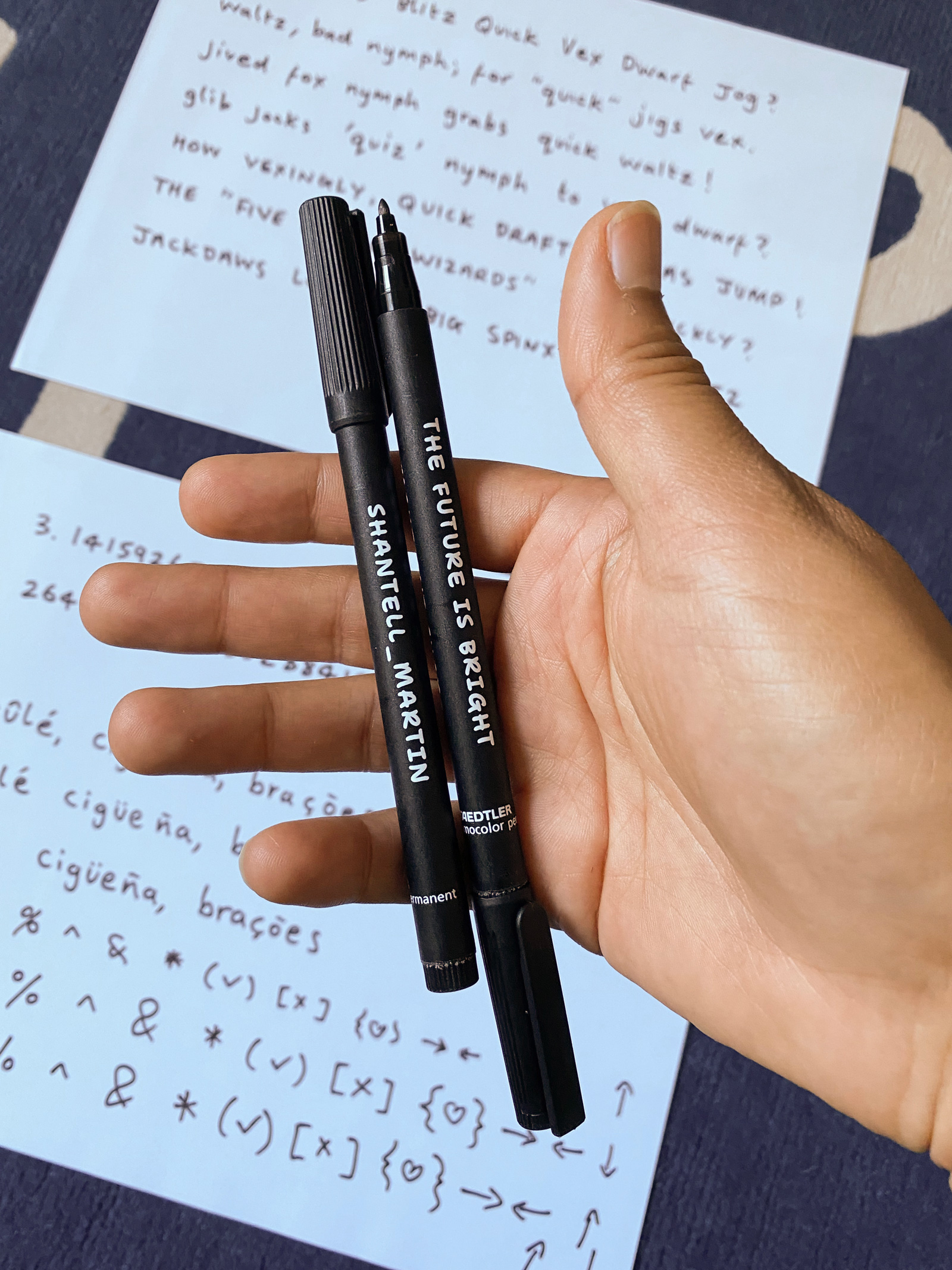
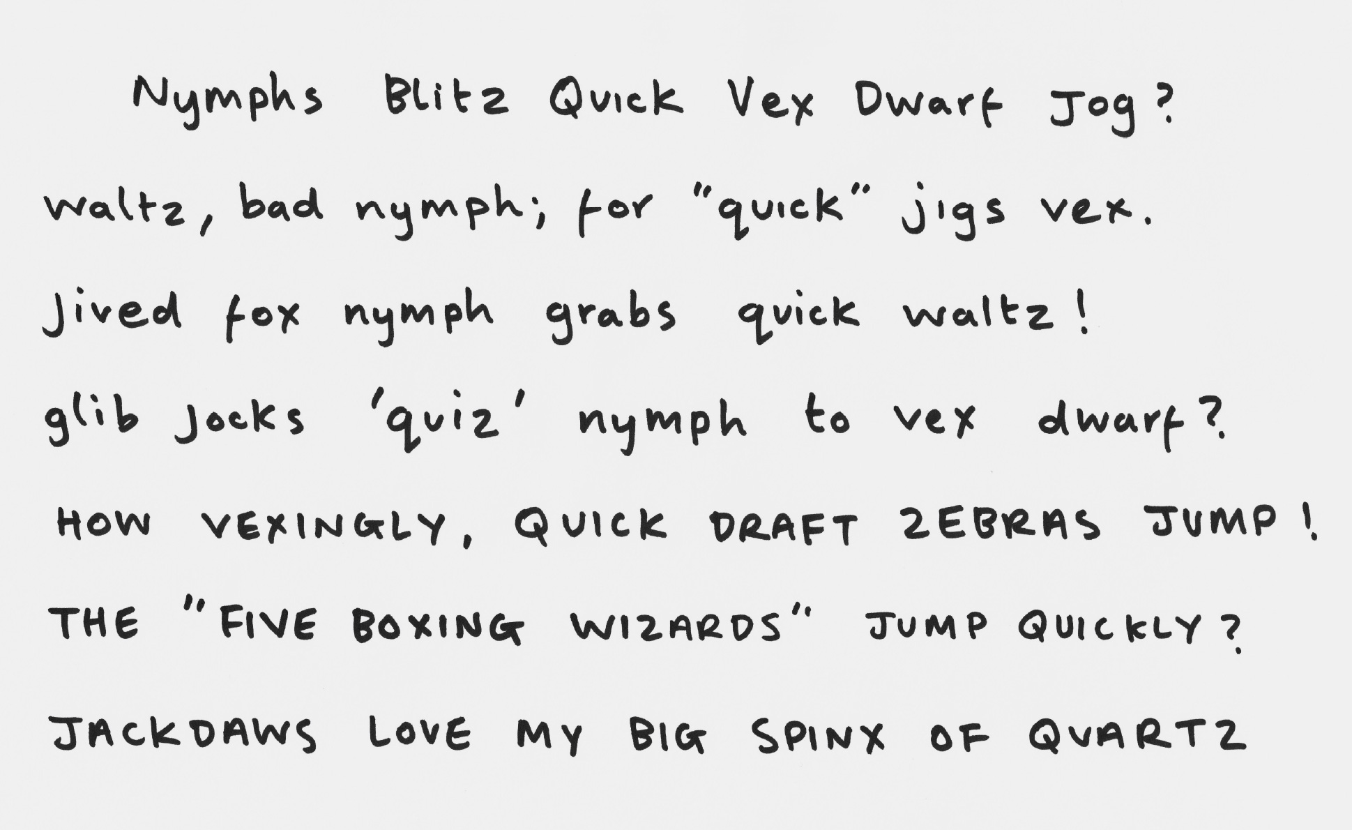
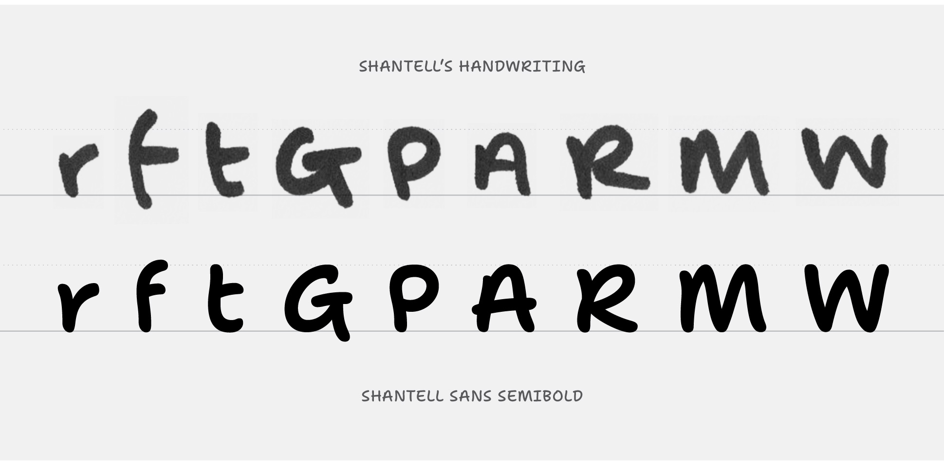
The letterforms came from sampling scans of Shantell’s writing with a medium-thickness felt-tipped marker, as she likes to use this for many of her drawings. This may sound as simple as selecting one of each character, running an auto-trace operation in a program like Adobe Illustrator, and popping the resulting outlines into a font. After all, there are various online services that do basically that! Of course, this is an approach you can use to create a handwriting-based font, but it is inherently limiting.
Fonts are drawn with vectors outlines so that they can be infinitely scaled and retain their shaping. Auto-traced vectors can scale, too, but due to their messy point structure, they only truly look good at a single scale, and they aren’t practical for more variable axes, like Weight.
Additionally, auto-tracing scanned outlines would only ever allow a font to use the proportions and imperfections available from a scanned sampling of writing. Great fonts, however, improve upon the utility and readability of handwriting by carefully balancing letter proportions, shaping, and spacing.
The process of Shantell Sans, therefore, started by determining the general form of each character as written by Shantell, and then moved into harmonizing these forms into a useful, beautiful typographic system. This included drawing the core forms in lighter and bolder outlines that could interpolate well in a variable Weight axis, as well as spacing and kerning these styles to create an even rhythm.
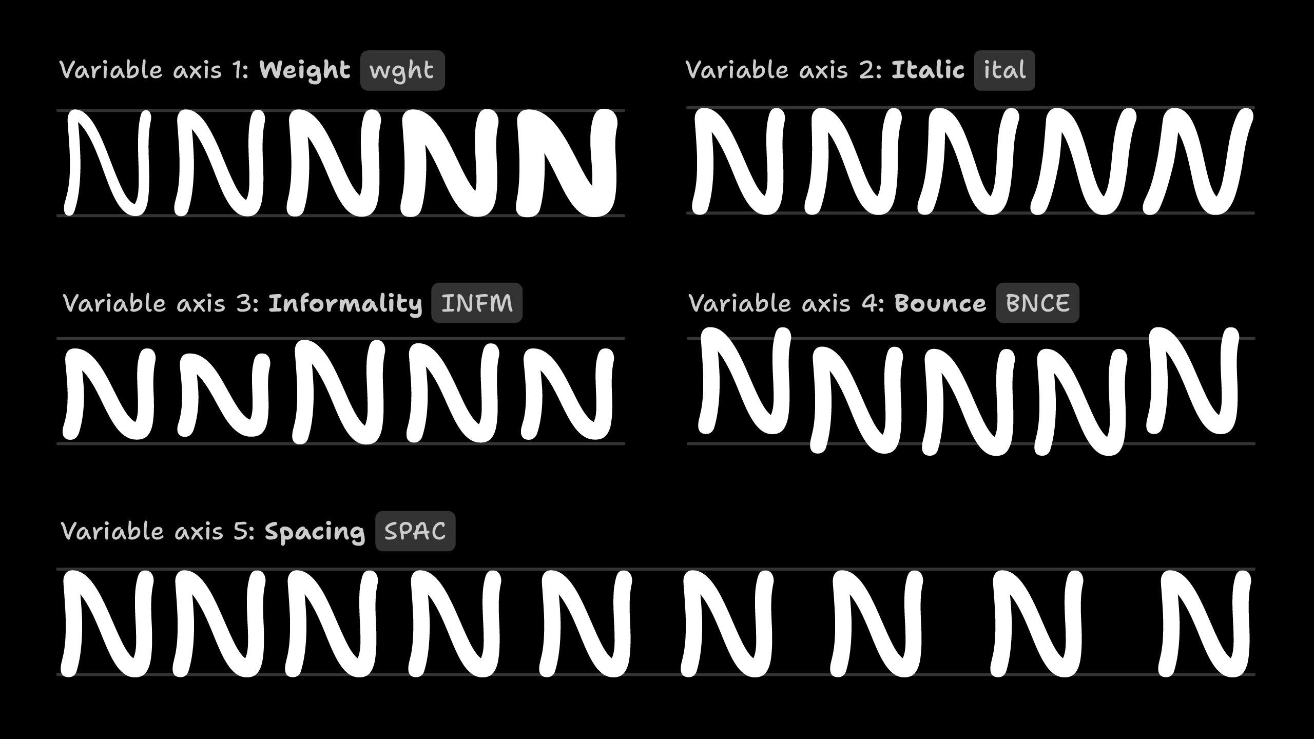
To reintroduce some of the inherent variety of Shantell’s handwriting, a second set of fonts were drawn to emphasize the irregularity and liveliness in the scans. And then, in a font build process, Python scripts took the two sets of drawings, and generated in-between variations and alternates. In the final fonts, the variable “Informal” and “Bounce” axes allow the end user to decide how much harmonization vs irregularity they want. In the end, Shantell Sans gives users five variable axes to play with.
As a bonus, Shantell and I pitched Google Fonts to support the project for an open-source release, and Google Fonts pitched in to support a few major extensions!
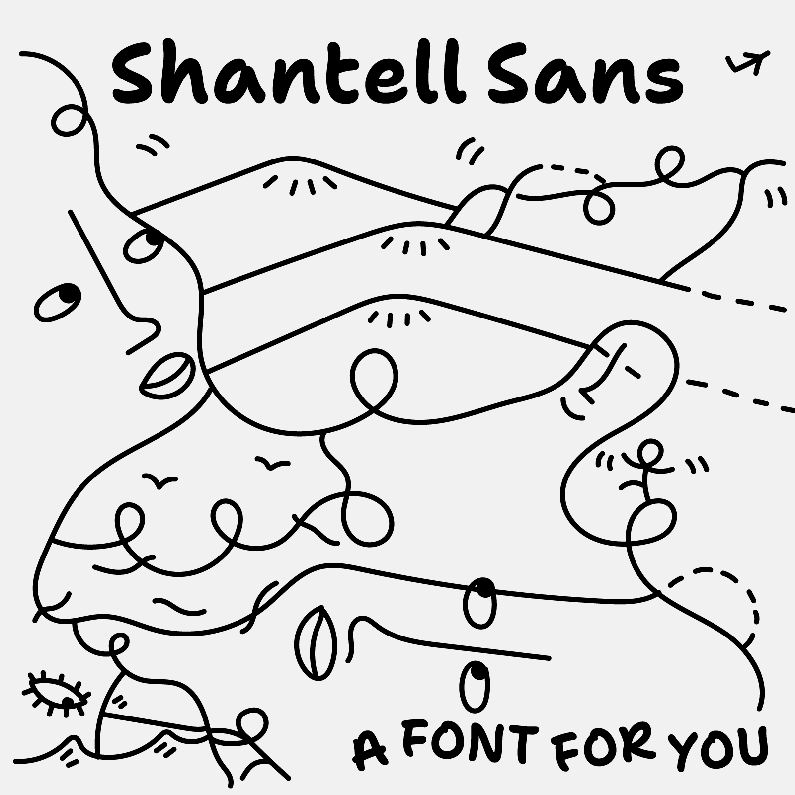
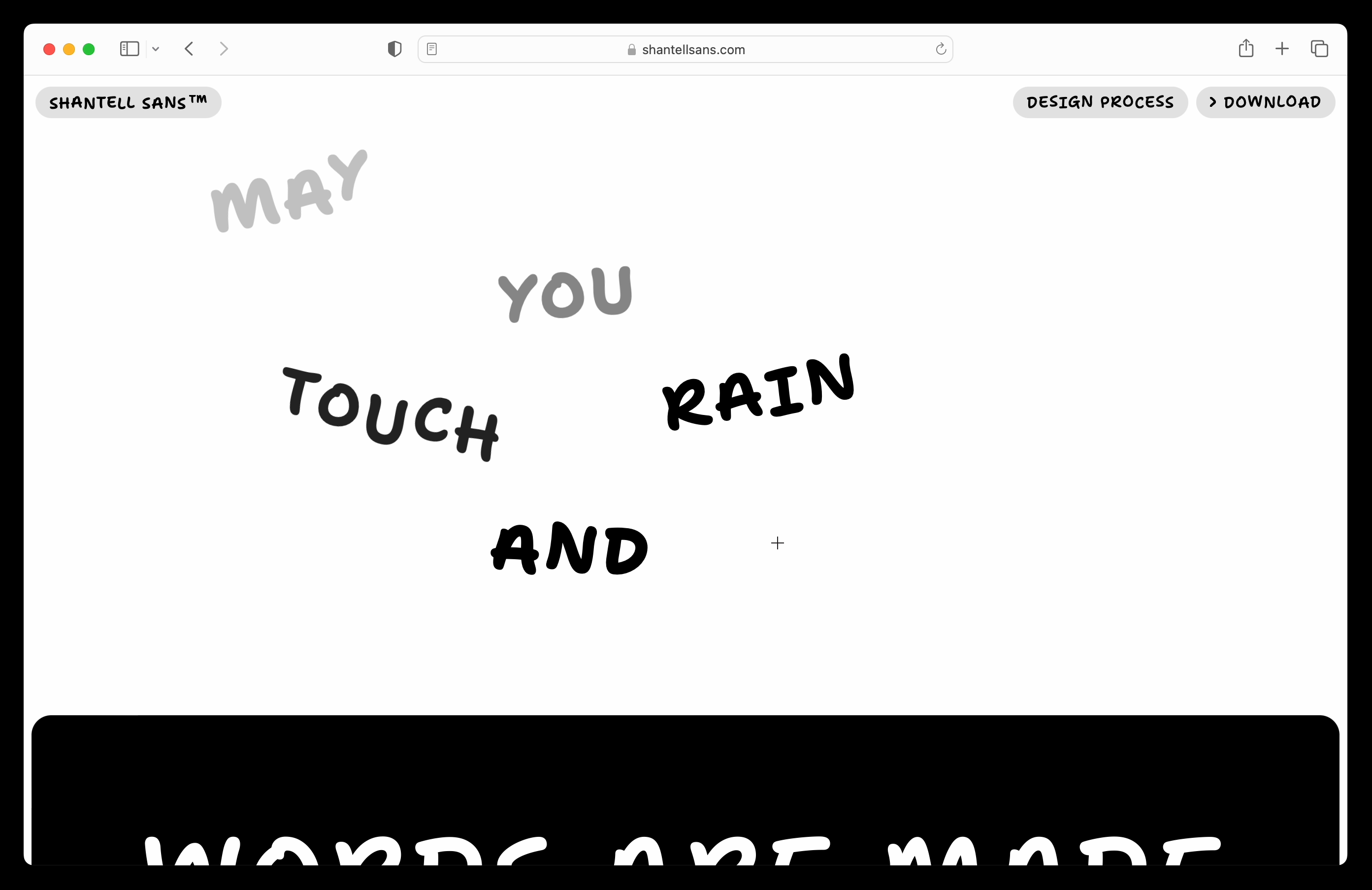
At a basic level, Google Fonts supported me in extending the character set, and creating additional axes for Italics and Spacing. They also supported us in creating a minisite to celebrate the project, with poetry and creative vision from Shantell, plus design and web development by me.
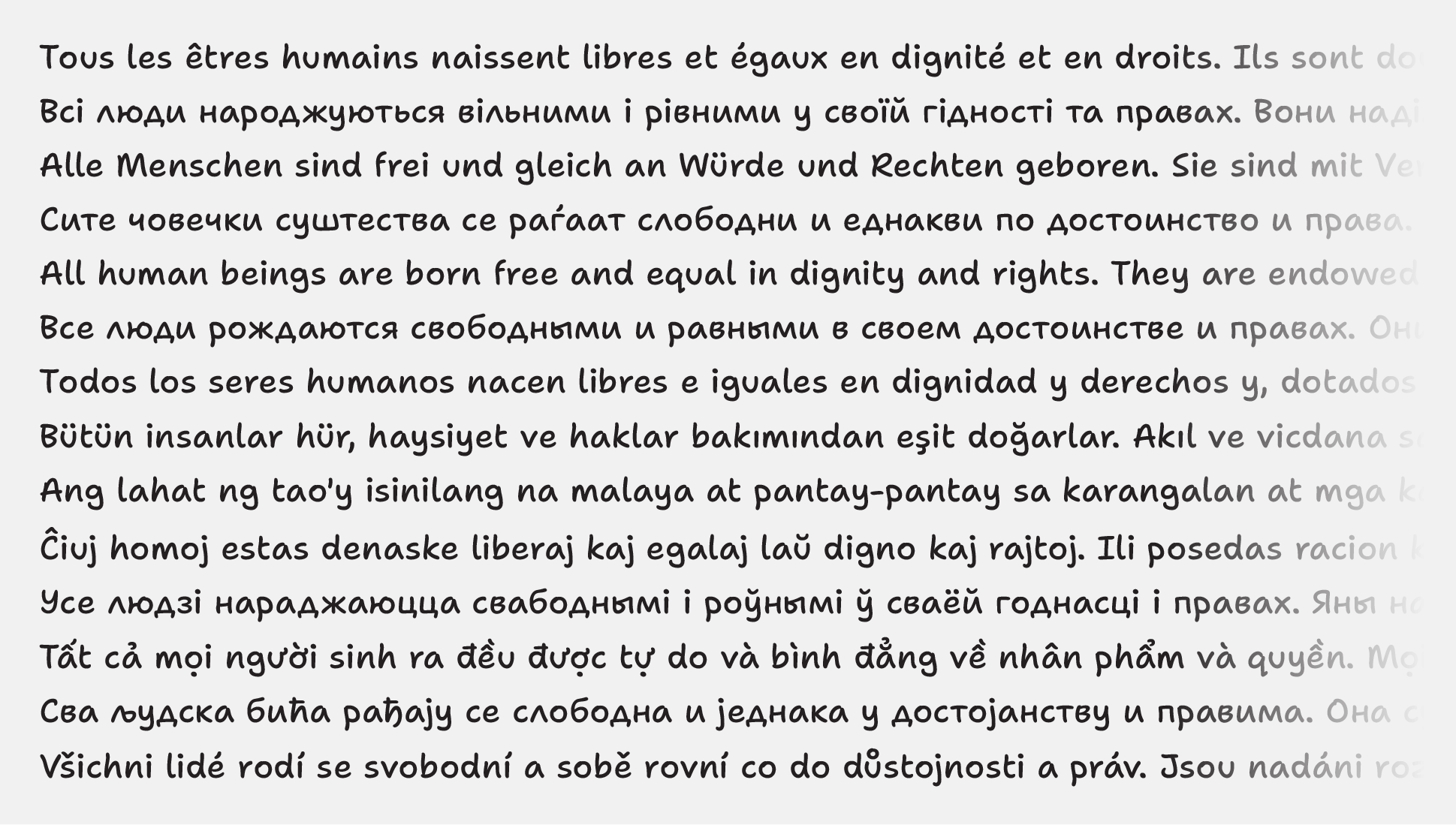
Even better, the additional support from Google Fonts allowed us to hire Anya Danilova to extend the typeface to include Cyrillic script, which makes Shantell Sans useful for many more languages.
Working with Anya was a blast! She is a great type designer, and did a great job interpreting Shantell’s Latin script writing into a whole new character set. With Anya’s help, we were able to extend Shantell Sans from supporting about 330 languages to supporting 400+ (as determined by Hyperglot).
Shantell Sans is open-source and available under the SIL Open Font License, Version 1.1, so you can freely use it for almost anything (but as always, please read the font license before using it). You can download Shantell Sans and learn more about it at shantellsans.com. You can also read a more in-depth design process article, including perspectives and additional details from both Shantell and Anya.